Probability distribution of marks should not be normal.
What type of variable is the mark, discrete or continuous?
Marks is a discrete random variable that has a finite number of values or a countable number of values.
A continuous random variable has infinitely many values, and those values can be associated with measurements on a continuous scale in such a way that there are no gaps or interruptions.
Requirements for a Probability Distribution
1. ΣP(x) = 1 where x assumes all possible values of marks
2. 0 ≤ P(x) ≤ 1 for every individual value of x
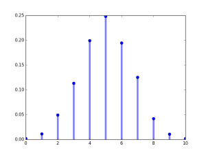
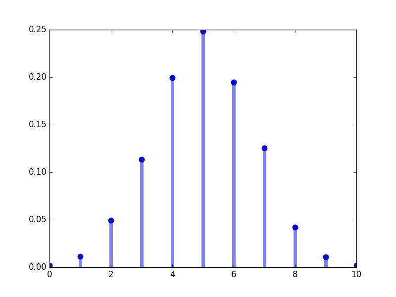
For example, 2000 students gave exams with full marks of 10, the probability distribution of marks to have a normal like curve will have following frequency distribution given in the table.
But frequency distribution like this is very difficult to achieve and based on many different factors, such as question difficulty, learning levels of students.
Do we even require such a curve?
About 37% of students will score below marks 5. So the performance of many students is too low.
Only about 5% will score 8 and above. The goal for score 8 and above becomes too unrealistic.
So we don't want a bell curve in education. If we are getting a bell curve, then our education system is very wrongly designed and implemented.
What type of graph should our education system have?
This is perhaps a better distribution, which our education system should have, and should achieve where about 92% of students score 7 and above. The goal should be to make every student score 7 or more, and the difficulty of questions should be realistic to achieve.
An ideal marks distribution with total of 100 marks.
Marks is a discrete random variable that has a finite number of values or a countable number of values.
A continuous random variable has infinitely many values, and those values can be associated with measurements on a continuous scale in such a way that there are no gaps or interruptions.
Requirements for a Probability Distribution
1. ΣP(x) = 1 where x assumes all possible values of marks
2. 0 ≤ P(x) ≤ 1 for every individual value of x
For example, 2000 students gave exams with full marks of 10, the probability distribution of marks to have a normal like curve will have following frequency distribution given in the table.
| Marks x | Frequency f | Probability P(X=x) |
|---|---|---|
| 0 | 4 | 0.002 |
| 1 | 23 | 0.0115 |
| 2 | 99 | 0.0495 |
| 3 | 227 | 0.1135 |
| 4 | 399 | 0.1995 |
| 5 | 497 | 0.2485 |
| 6 | 390 | 0.195 |
| 7 | 251 | 0.1255 |
| 8 | 84 | 0.042 |
| 9 | 22 | 0.011 |
| 10 | 4 | 0.002 |
import matplotlib.pyplot as plt
import random
import numpy as np
from collections import Counter, OrderedDict
fig, ax = plt.subplots(1, 1)

od = OrderedDict([(0.0, 4), (1.0, 23), (2.0, 99), (3.0, 227), (4.0, 399),
 (5.0, 497), (6.0, 390), (7.0, 251), (8.0, 84), (9.0, 22), (10.0, 4)])
print(od)
val = sum(od.values())
probability = []
for prob in od.values():
    probability.append(prob/val)
print(probability)
print(sum(probability))
ax.plot(list(od.keys()), probability, 'bo', ms=8,
label='probability distribution')
ax.vlines(list(od.keys()), 0, probability , colors='b', lw=5, alpha=0.5)

plt.show()
But frequency distribution like this is very difficult to achieve and based on many different factors, such as question difficulty, learning levels of students.
Do we even require such a curve?
About 37% of students will score below marks 5. So the performance of many students is too low.
Only about 5% will score 8 and above. The goal for score 8 and above becomes too unrealistic.
So we don't want a bell curve in education. If we are getting a bell curve, then our education system is very wrongly designed and implemented.
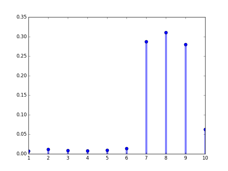
What type of graph should our education system have?
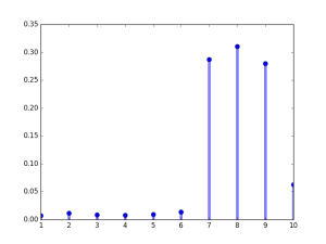
This is perhaps a better distribution, which our education system should have, and should achieve where about 92% of students score 7 and above. The goal should be to make every student score 7 or more, and the difficulty of questions should be realistic to achieve.
| Marks x | Frequency f | Probability P(X=x) |
|---|---|---|
| 0 | 0 | 0 |
| 1 | 15 | 0.007503751875937969 |
| 2 | 23 | 0.01150575287643822 |
| 3 | 18 | 0.009004502251125562 |
| 4 | 16 | 0.0080040020010005 |
| 5 | 19 | 0.009504752376188095 |
| 6 | 27 | 0.013506753376688344 |
| 7 | 575 | 0.2876438219109555 |
| 8 | 621 | 0.3106553276638319 |
| 9 | 559 | 0.27963981990995496 |
| 10 | 126 | 0.06303151575787894 |
import matplotlib.pyplot as plt
import random
import numpy as np
from collections import Counter, OrderedDict
fig, ax = plt.subplots(1, 1)
od = OrderedDict([(1, 15), (2, 23), (3, 18), (4, 16), (5, 19),
 (6, 27), (7, 575), (8, 621), (9, 559), (10, 126)])
print(od)
val = sum(od.values())
probability = []
for prob in od.values():
    probability.append(prob/val)
print(probability)
print(sum(probability))
ax.plot(list(od.keys()), probability, 'bo', ms=8,
label='probability distribution')
ax.vlines(list(od.keys()), 0, probability , colors='b', lw=5, alpha=0.5)

plt.show()
An ideal marks distribution with total of 100 marks.


Comments
Post a Comment